Tag - Business Content

Importance of Infographics in Marketing

Do you make use of Infographics in Marketing?

Use of infographics in marketing in very common these days. image shows some infographic elements and shapes.In this age of big data, the entire gamut of digital marketing has shifted towards processing data and information. In such an environment, it is almost binding that the presentation of data be in a lucid format that allows users to analyze and arrive at a certain decision about a product, service or trend. So, putting your data represented in an infographic form is one of the game-changing aspects that may usher in unprecedented returns for your investments.

What is an Infographic?

An Infographic is the graphical representation of a data or set of data. An Infographic data form basically repaints mundane or at times, complex information in a manner that gets a trending response from its subscribers. An infographic that explains the steps for online shopping.

Why an Infographic?

It is often noticed that complex piece of information such as metrics or comparison of trends over years, geographies or among competitors in plain numeric or textual form, is usually hard to analyze. Plain depiction of tabular data often poses a cognitive barrier between the information and the user.

While on the other hand, the same data when arranged in forms of graphs and charts, becomes highly convenient for audience to not only understand and analyze but to also use it further. This simple phenomenon makes Infographics very useful resource for your business.

Does it help to use Infographics in marketing? 

Just like the company logo or other branding material, Infographics help you develop that special connect with your customers. Once they like your campaigns that use memorable illustrations, the brand recall improves considerably and your potential customers are likelier to remember you at the right time.

How to develop a good Infographic?

Designing a good infographic, first of all, requires a deep understanding of the company’s business: products, services, customers and target base. This determines the information that needs to be presented for everyone’s consumption. It is necessary to ensure that it does not go against the business ethics or is not debatable.

The next step towards developing attractive infographics is to acquire an expert graphic designer who can visualize and translate this data into visually appealing creatives that can attract maximum attention once shared across various platforms.

Who can develop a good Infographic for you?

While the idea of developing an Infographic might sound simple, yet you should know that it requires sophistication and a certain skill set. Remember that a poor design may bring more of harm than utility to your brand.

Of course, the best infographic content will come from your business development team itself. However, it might serve better to get fresh ideas from an agency. So, it is wiser to hire a creative agency with proper credentials as well ensure that the team members on board are mature enough to understand your business dynamics.

Ascezen Consulting is one such agency that can deliver quality infographics within the budget constraints.

Why Ascezen?

The team behind Ascezen Consulting Pvt. Ltd. carries vast industry experience. The talent that has been delivering for some of the most prominent brands in IT, Retail and Hospitality sectors will now be focused to create value for your brand, while putting latest tools and best practices available at your disposal.

 

Read more...

How can a Case Study help in Selling?

A case study is a piece of writing that highlights a problem faced by an individual or an organization and elaborates how it got solved. All the business decisions inarguably stem from a problem at hand with the decision being the best feasible solution. A case study defines the entire course of action from identifying a problem to implementing a solution and getting desired results.

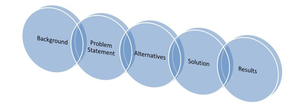
Picture showing the names of the parts of a case study: Background, Problem Statement, Alternatives, Solution, and Result.

Anatomy of a Case Study

Case studies demonstrate the problem-solving capability needed to address similar problems for other people as well as organizations. When presented to a potential customer, case studies form an impression that the vendor or the service provider has proven expertise in resolving the particular kind of problem.

Typically, the anatomy of a case study includes sections such as Company Background, Detailed Problem Statement, Possible Alternatives Considered, The Best Solution, and The Results – positively impacting the bottom line.

The best case studies would mention the names of the organizations, products, place and time to make it look real and verifiable. The icing on the cake happens to be a client testimonial that corroborates the claims made in the case study document. It helps a company pitching for assignments prove to its prospects that it has the required experience and expertise to solve their problems.

From the above sections, it can be made out how convincing it can be to use case studies in pitching for sales. No argument or claim can be better than saying it through past work. All this makes case studies a very potent, though silent, weapon to win over your competitors in battle of achieving sales targets. Despite all this, there is a very important aspect to case studies, which has to do with how well they are written.

At Ascezen, we create convincing and compelling case studies to help you boost your sales by strengthening the sales pitches. Our business writing team can do it for you at rates that mean nothing when compared to what they help your organization achieve.


Read more...

Creating an Effective Presentation

Presentations make a powerful medium to share information or sell products and services. Have you ever wondered what Effective Presentationmakes a PowerPoint presentation effective? Most of us are unsure when asked to make one. What makes a PowerPoint presentation become effective? Is it about the appealing visuals or catchy phrases? Or has it got to do with jazzy animations? Naturally, we end up asking experts for their inputs to reach some conclusions. Honestly, there isn’t a single thumb rule to achieve that but there surely are a few best practices widely acknowledged and accepted. There are certain do’s and don’ts to be followed while making PowerPoint presentations. Some tips to create an effective presentation are as below:

Get hold of the viewer’s attention

This is one of the most important aspects of a presentation. At the beginning of a presentation, one has to attract the attention of their audience. Grabbing their attention does not mean to overcrowd your slides but instead make them look effective. If your presentation is not able to retain the audience’s interest, all your hard work may go waste.

Keep it simple and clear

A good presentation is easy to follow. One must always keep in mind that the content should flow smoothly without confusing the audience. There shouldn’t be conflicting ideas or contradictory statements within a single presentation. The content should use simple, clear words to reach the audience.

Do not overcrowd the slides

Every slide should cover a uniform number of points, for example, limit the number to 5 or 6 points for each slide. Considering the font used, we must keep in mind how many points can be accommodated on each slide to avoid the clutter on the slides. Keep the points short and brief. To make your presentation effective, always filter unnecessary information.

Maintain the word limit

Effective presentations generally deal with the right words, at the right place, in the right tone. We must always take care of the number of words used in each point or sentence. Always try to convey the message effectively in the least number of words possible.

Be careful with images and animations

To make your PowerPoint presentations appear catchy and appealing, always try to use images related with the topics covered. The use of animations should be judicious such that it shouldn’t distract the audience.

Choose right fonts, sizes and colors

The latest versions of Microsoft Office offer a variety of options when it comes to choosing the fonts. An effective presentation should contain font sizes which are legible for a large audience. Avoid using light font colors as it might not be clearly visible to viewers at a distance. Instead, the use of contrasting colors is recommended. Fonts and their sizes should be chosen keeping in mind that they do not appear blurred or pose any difficulty to the audience.

Maintain consistency and flow

It is vital to ensure consistency within and across all the slides to create an efficient presentation. For example, a presentation should have carefully designed slides to mark the beginning, main content and a logical end.

Read more...